Tuesday, August 16, 2011

Intelligent Music Tastes


Although people do talk about taste as though it can obviously be ordered in terms of good to bad, most would be hard pressed to come up with a good reason justifying those judgments. Indeed, upon reflection they would probably concede that taste is simply a given and that judgments on the relative merits of different tastes boil down to prejudice. After all, one cannot really say that there is something wrong with liking, or not liking, peanut butter. Some say that tastes are just the way we were wired at birth, but that’s not entirely true. We do inherit different amounts of the various kinds of taste buds so the same food may taste different to each of us right from the start. Nevertheless our food preferences – like our religion and many other things – are usually those we were raised with. Preferences are also conditioned by subcultures as well as individual or random associations.

So if tastes are largely determined by genes and culture does that mean they are beyond comparative judgment? Politically correct opinion these days is that it is simply prejudice to say that one culture is better than another. That’s a bit short sighted. When you look at some aspects of culture it becomes obvious fairly quickly that some variations are better than others. For example the Arabian number system that we all use today is clearly an improvement on the Roman number system; writing was a big improvement over having people remember everything; the adoption of systematic error correction - in the scientific method and in legal procedures - has improved our lives immensely; where cultures differ in the degree of senseless cruelty they accept, the more humane cultures are better in that respect, etc, etc.

In principle therefore we can make unprejudiced judgments on phenomena that are at least partially culturally determined. That judgment might legitimately take the form of saying that a taste is to some extent more or less intelligent than the alternatives. Or can it? The cultural aspect the person prefers may well be better than the alternatives but he may simply prefer it because he was raised with it and thinks “my culture is best”. That’s hardly being intelligent. What we need is some evidence that intelligence leans toward certain preferences within a pool of alternatives, within and across cultures and sub-groups.

We know that men like action movies more than women and that women tend to like romance movies more than men, but what we want to know is do intelligent men and women like action and romance movies more or less than the average men and women. Suppose 75% of men and 45% of women like action movies and 30% men and 80% of women like romance movies. If we find that 50% of very intelligent men and 85% of dull men like action movies (and the percentages are 35% and 50% of smart and dull women respectively) then we might conclude that action movies appeal to stupidity. Of course it doesn’t follow that romance movies would therefore appeal to intelligence. We might find a similar shift away from enjoying romance movies too. It might turn out that smart people disproportionately like ‘art movies’.

I was looking at various items in the General Social Survey and came across a number of questions on musical preferences and noticed that almost all of them correlated in some way with the GSS’s mini-IQ scale (a 10 item vocabulary test that correlates 0.7 with a full IQ scale). Many people I shared this with expressed a great deal of skepticism about the notion that musical preferences could be better or worse – let alone smart or stupid. Some suggested the correlations I noticed must be an artifact of say socio-economic status being partly a function of intelligence and that the music tastes simply reflect the SES differences. On the other hand SES may be related to music taste because it reflects intellectual differences. One of the virtues of the GSS is that it allows one to test such hypotheses.

Class and education, race, sex and generation each represent an obvious subculture with respect to music preferences. Who hasn’t heard someone say that classical music is pretentious, that show tunes are for women and gays, that blacks like rap and jazz and whites country, or an old person say the music of today’s youth is just noise? If music tastes are to some degree really due to intelligence then I need to show that intelligence is still related to music preference even after accounting for these sub-cultural influences. Multiple regressions are a statistical technique that allows one to look at the influence of each sub-culture, and of intelligence, independently of each other. So I ran a multiple regression on the degree to which each type of music was liked or disliked, using the vocabulary scale, social class, race (black and white only), sex, age and amount of education as independent variables.

In the table below I show whether the relationship was significant (unlikely to be due to chance) and the direction of the relationship.


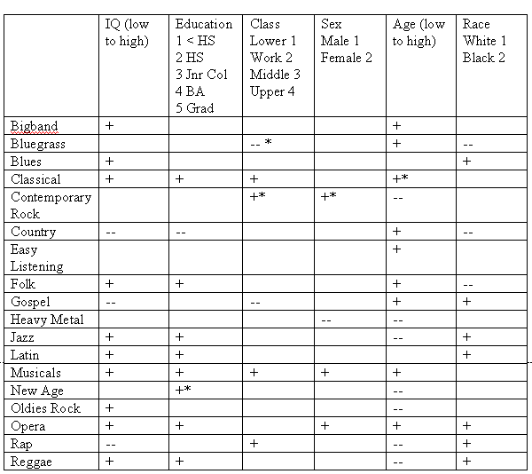
- A * indicates significance at the 10% level, all others are at 5% level.

Some well known results pop out - we see that being black increases the chances that you will like Blues, Gospel, Jazz, Latin, Opera, Rap and Reggae, and reduce the chances of liking Bluegrass, Country and Folk. (OK so Opera was a surprise to me.) Older people are less likely to like newer music, like any kind of Rock, Jazz, New Age, Rap or Reggae, and more likely to like older music genres, than the youth. Women like Musicals more, and Heavy Metal less, than men. Classical music does live up to its pretentious reputation but strangely Rap is an upper class taste too.

Also note that the racial, class, gender and generational differences in taste cut across both smart and dull tastes i.e. are not due to intellectual differences between any of these groups. However educational differences in taste do track IQ differences in taste – even though the two factors are independently evaluated in the analysis. One would expect that the role of education would reflect intellectual factors but here it reflects the intelligence of those who designed the curriculum, rather than that of the student.

The interesting result is that IQ is frequently significantly related to how much people like or dislike music. Even after the cultural influences are accounted for 13 of the 18 music genres still show a relationship to intelligence. Furthermore the independent effect of intelligence is usually relatively strong – about equal to all the cultural influences combined. Clearly differences in music tastes are partially due to differences in intelligence, and the connection isn’t explicable in terms of arbitrary connections between IQ and culture.

But what is it about the music that appeals to intelligence or stupidity? One way we can shed light on this is to look at pairs of musical tastes that typically coincide – in the sense that if you like one kind of music you are very likely to like the other. If one of the pair correlates with IQ and the other doesn’t, then we can use this to isolate the intellectually relevant appeal of the music. A liking for Rap tends to coincide with liking Reggae, Jazz and Blues, and the 4 share features that appeal to some people and which others dislike. In the Table you see that the latter 3 are positively related to IQ while enjoyment of Rap is negatively related. What this implies is that it is specifically not those aspects which Rap shares with Reggae, Jazz and the Blues that is relevant. It is what is unique about Reggae, Jazz and the Blues on one hand, and Rap on the other, that taps into the intellectual side of taste. We would need to zero in on what makes people like Reggae, Jazz and the Blues that wouldn’t help them like Rap, and visa versa.

Similarly I found that what separates Folk music from Country & Western or Gospel music, and what separates Oldies Rock from Contemporary Rock and Heavy Metal, also isolates the intellectual side of musical tastes. There is something in Folk music that Country music doesn’t have (or something unintelligent in Country that Folk doesn’t have). There was something in Early Rock music that the Rock music of today, and Heavy Metal, is just missing. What did Jazz have that Rap has lost, or what features has Rap introduced (which appeal particularly to the dull) that Reggae and Jazz never had? The answers aren’t immediately apparent and I’m afraid the GSS data doesn’t have any more to add to the subject.

I would be willing to bet that with the right data I would find that intelligence is relevant to taste differences in the visual arts too i.e. paintings, photos, interior decoration, clothing and hair fashions, architecture, car design, jewelry, etc.

A concept I’d like to introduce here is something I call The Smart Vote. This is based on the notion that IQ is the ability to be correct given a fairly standard experience with the subject matter. High IQ people have shown that they are reliably correct and low IQ people that they are reliably incorrect, across a wide range of subject matter and problem types. So where high IQ people agree on a different answer to that agreed upon by low IQ people, the chances are extremely good that the high IQ preferred answer is correct. The Smart Vote is not what the majority of smart people prefer but rather the direction in which their preferences differ from those of the dull. Where a systematic difference of opinion between high and low IQ groups exists, it usually points to the most correct alternative.

I have shown that The Smart Vote exists for music tastes and that it isn’t accounted for by cultural influences, so it would seem that musical tastes can probably be correct or incorrect. Good and bad taste is not merely prejudice.

Thursday, July 28, 2011

Life Expectancy - the Blue to Red Zones

There is a lot of interest in increasing life expectancy. Who after all doesn’t wish to live longer? Since life expectancy differs markedly across countries researchers have naturally tried to tease out the reasons. Some obvious findings are that high levels of infectious diseases lower life expectancy, and wealth and good medical care increase it.

One of the ideas being bandied about is that dietary differences are important. The reasoning is that once you control infectious diseases life span depends on the lack of degenerative diseases like heart attacks or cancer, and there is a fair amount of evidence that unhealthy diets are a major cause of degenerative diseases. The appealing thing about the focus on diet is that it is something we can control.

Unfortunately there is disagreement (even among experts) about what the ideal diet would be. Some look at the association between saturated fat consumption and degenerative diseases and emphasize a plant based diet. Others insist that large quantities of carbohydrates, not fats, are the central cause of degenerative disease. Some swear by good fats e.g. olive oil, nuts and seeds and fish, and red wine. Some blame dairy products for a lot of health problems while other researchers say that milk consumption actually lowers belly fat and that Sardinians live long lives on a lot of goat or sheep milk. There seems to be no end to the arguments. One way to sort this out is to look at which populations live long healthy lives and note what they eat. The problem with this approach is that there are always confounding factors that muddy the picture. So I applied my mind to ways of isolating the effect of diet.

The first thing that occurred to me was that infant mortality reflects disease load, hygiene and quality and availability of medical care. So life expectancy - controlling for infant mortality - should isolate the relevant lifestyle and dietary factors. The second thing that occurred to me was that although the effect of wealth on disease control, health care and hygiene is captured by infant mortality it also plays a role beyond medical factors e.g. safety. So it would be worthwhile to control for GDP per capita too. The third thing that occurred to me is that mean IQ is strongly correlated to infant mortality, life expectancy and GDP per capita. IQ would be a major confounding factor so I controlled for mean IQ too. IQ and GDP per capita might be called ‘means to health’ factors. IQ alone accounts for 54% of the variance in life expectancy and GDP per capita adds another 3%.

I initially ran a regression on life expectancy with infant mortality, IQ and GDP per capita as predictors, and looked at the residuals. What struck me was that all the countries with high AIDS rates were clustered at the bottom. So I added AIDS prevalence (and then later smoking) rates, as additional predictors.

Interestingly I found that the ‘means to health’ factors do not add much to predicting life expectancy, once the effect of infant mortality is controlled for. This doesn’t mean that the ‘means to health’ factors only work by reducing infant mortality. It means that the ‘means to health’ factors work on what infant mortality and life expectancy have in common. I think it lends credence to my initial assumption – that infant mortality is a good proxy for disease load, hygiene and the availability and quality of medical care.

The regression was extremely accurate – accounting for 92.4% of the variance in life expectancy in 185 countries. Infant mortality and AIDS alone accounted for 90.2% of the variance. Clearly life expectancy is mainly about avoiding diseases and getting good medical care. Improving disease control and medical care, to the extent that every country would have an infant mortality equal to the current minimum and a zero AIDS rate, would move average country life expectancy from 70 to 78 and reduce the standard deviation from 10 to 3.8. There would still be a good 5 years difference in their life expectancies of the top and bottom 20% of countries. These differences would mostly be accounted for by diet and community – in other words, lifestyle differences.

So lets look at which countries have the healthiest lifestyles (outside of disease control, hygiene and wealth and safety). The map shows the results according to the following color codes. The figures are years above or below expected.

Red - <=-4 years Orange -4 to -2 years Yellow -2 to 0 years
Green 0 to +2 years Light blue +2 to +4 years Dark blue => +4 years


You can see that certain regional trends are evident. Firstly there is a tendency for bad lifestyle countries to be in the same regions. Most of Asia; South, Central and West African; and the Arabian Peninsula, would have below average life expectancies if all countries had the same IQ, disease and AIDS rates, wealth, medical care and smoking habits. East and Northern Europe would also be below average. You can’t see it on the map but all the Pacific Islands would tend to be bad too. I call the worst of these, Red Zones. They are of course red on the map.

On the other hand South Western (or Mediterranean) Europe would have above average life expectancy residuals. North Africa, the Middle East and the South West Asia and Caucasus region are good. So are East Africa, and Japan, Thailand and Cambodia. The whole of the Americas are good - especially the Central and South parts. Not seen on the map is that the Caribbean Islands are also above average to good.

Some of this isn’t a surprise. The so called Blue Zones (Sardinia, Italy; Okinawa, Japan; Loma Linda, California; Nicoya Peninsula, Costa Rica, and Icaria, Greece) all fall within the latter group of countries. Blue Zones are places where high percentages of the adult population live to very advanced ages – at least 90 and often 100 - in good health and in a functional state. The really good areas are therefore blue on the map, with dark blue being outstanding.

There is a literature on these Blue Zones which is well worth studying. However the map suggests that places other than the already identified Blue Zones should be looked at too. Spain, Portugal and North Africa stand out and have some dietary and lifestyle affinities with Sardinia, Icaria and the Mediterranean region in general. So too does the Middle East (outside the Arabian Peninsula) and South West Asia/Caucasus region. East Africa is another region (with Middle Eastern influences) worth studying. Georgia is particularly interesting for several reasons. It is an especially good zone (dark blue) and was once it was rumored to be the location of a Blue Zone. The Caucasus area in general is good but transitions to very bad as soon as one gets to the non Caucasus parts of Russia.

Then there are a host of Central and South American countries other than Costa Rica that come up as blue on the map, so the dietary and lifestyle traditions of this whole region bears looking at. An interesting finding is that adult Hispanics in the US live longer than the much wealthier US white adults. Presumably they maintain some of their diet and lifestyle traditions after emigrating.

The USA is usually the poster child of bad lifestyles and diets. The USA is in fact bad relative to the best but it turns out that so many countries are even worse that the USA turns out to be above average.

On the other side of the picture are those sad countries who diets and lifestyles one would do well to avoid – the Red and Orange (and maybe even yellow) Zones. What is wrong with the diets and lifestyles of Southern, Western and Central Africa? Why are Russia and the former Soviet Union so bad? Why is Northern and Eastern Europe below average? Why are India and China below average?

The Blue Zones have certain things in common. They all favor plant based foods - particularly legumes (from Fava, soy and pretty much any beans to chickpeas and lentils), whole grain cereals (wheat, corn and maybe rice), high nutrient fibrous vegetables, starchy yellow vegetables (sweet potato and pumpkin) and nuts. Fruit seems to be something consumed in moderation. Yogurt is also common in these regions. Of course their consumption of foods not on the list is very low. They all have high levels of moderate activity and some sunshine as part of their daily lives. Their lifestyles are ‘chilled’ rather than time urgent and they have very high levels of social engagement within extensive and supportive social networks. Red wine and olive oil (oily fish) is a common factor around Christian Mediterranean areas. Smoking is something they all avoid.

Georgian cuisine is built on wheat and corn, beans, olive oil, walnuts, lean poultry, some red meat (mostly lamb but also beef and pork), freshwater fish, vegetables (mainly eggplant, a variety of spinach and mushrooms) and a strong yogurt and some cheese. The alcohol is wine or a grape based spirit. In short it is very much a Middle East/Mediterranean diet i.e. plenty of low glycemic index carbohydrates, healthy fats, yogurt and wine and few bad fats, refined carbohydrates or root vegetables. Living in the mountains makes for plenty of exercise whether you like it or not.

The unfortunate thing about these diets and lifestyles is that are generally those of the poor, and most of those very people would prefer not to eat and live like that. As soon as they become a little wealthier they start eating a lot more meat, fat, refined carbohydrates and calories overall.

That’s all very interesting but if the Red Zones follow similar diets and lifestyles the importance of those commonalities falls flat. Fortunately there are differences. The Russian diet is a case in point and is pretty bad. It is high in fatty meat, oil (not olive or fish), root vegetables (potato and beets), eggs (typically fried), salt, vodka and refined wheat and is low on vegetables, fruit and legumes. It emphasizes high calories – something regarded as self evidently good and healthy in Russia. This is in direct contradiction to experiments showing that lower calories (provided nutrient levels are high) result in longer life spans.

The staple diet of much of Southern, West and Central Africa are heavily based on starch – either root vegetables or grain (mostly refined) – and fatty meat (in stews or grilled). Although meat is favored many of them don’t get much (through poverty) and suffer protein deficiencies even though they eat enough calories to get fat. East Africa and the Horn use more legumes and milk and less meat in their diet. The Arabian Peninsula differs from the rest of the Middle East in that they eat relatively more meat (mostly chicken, sheep and goat). Northern European diets are heavy of fatty meat, cheese, potatoes and bread. The South Sea Islanders eat a lot of meat (and not as much fish as you would expect) and also starchy root vegetables like cassava. These Islands have some of the highest proportions of people overweight in the world. The Chinese and Indian diets have too little variety – rice is eaten for almost every meal – and too little protein. They eat so little protein in fact that the amount provided by hapless insects in the unhygienic vegetarian fare of poor Indians is enough to make them appreciably healthier than vegetarian Indians in countries where the insect load in food is lower.

The common denominators are high starch (root vegetables) and refined grain (and sugar) levels – and sometimes just too much rice - and a lot of meat (especially fatty meat). Too little protein plays a role in some places.

Advice

If you want to live longer then you would do well to try and adapt the Blue Zone principles to a modern and wealthier lifestyle but you don’t really want to live like the poor if you can help it. Try to take the traditional Middle Eastern/North African/ Mediterranean or Central/South American or Thai/Japanese (Okinawa) cuisine and give it a more gourmet twist. Develop a collection of 20 or so recipes from those cuisines. They should be simple to make and appeal to you i.e. be soul food rather than elaborate. Typically people only eat 10 different recipes over their whole lives so you don’t need to be endlessly creative. One good way is to substitute the ingredients of your habitual meals with ingredients emphasized in the Blue Zones and map areas.

The main ingredients are legumes of all kinds, whole grains, fibrous and leafy vegetables, nuts, yellow starchy vegetables (pumpkin/butternut or yellow/orange sweet potato), peppers, spices, olives (olive oil), yogurt (goat or sheep’s milk) and moderate amounts of low fat meats, fruit and red wine. No vitamin pills are involved but you probably wouldn't do yourself any harm taking a reasonable dose wide spectrum vitamin and mineral supplement regularly.

On the other hand any refined grain or carbohydrate is a no-no. Curiously root vegetables (especially potato) don’t seem to be good either. A recent study showed potato consumption accounted for 2/3 of bodyweight gains in the USA, and countries that have it as a staple tend to be Red and Orange Zones. Refined carbohydrates (bread and sugar) accounted for much of the rest of the USA bodyweight gains. Vegetable oils (other than olive oil) that don’t need to be refrigerated are also very bad. Very low protein is bad.

Try to exercise. Expensive gym memberships or formal workout programs aren’t necessary and aren’t part of the lifestyles of Blue Zones. Walking works and is a low stress convenient activity that can be combined with other purposes from just getting somewhere to thinking or walking the dog. There are lots of fun activities one can try too e.g. roller blades, physical games, even sex. In particular make sure you don’t spend much time sitting – especially when being passive, as in watching TV. Research shows sitting really does subtract the years off your life. A little flexibility and strength work is important too.

Develop your network of supportive relationships – friends, family and community. One can learn how to find people who interest you, to make more friends and how to cultivate them once they are formed. Increase the level of low level socializing i.e. not necessarily clubbing or going to expensive restaurants. Try to end bad relationships of all kinds – by either repairing rifts or dropping them altogether – because bad relationships are worse than no relationship. Help people regularly (because research shows that helping activities do increase happiness and welfare) but don’t let it become a duty that binds and weighs heavily on you.

While it helps to have a purposeful life (where your existence matters to other people) be careful not to let your purposeful life turn into a high pressure one. Try to trim the pressure and urgency from your life and adopt a more “chilled” approach to your purposive and necessary activities. Try to eliminate what isn’t necessary or important. Deliberate relaxation is very beneficial and socializing is better means than TV for many reasons. Yoga is something that can help to relax and some forms are also excellent sources of flexibility and strength work.

Wednesday, July 20, 2011

The Price of Religion

Ever wondered what religion is worth? Is it worth more than sex for example?

An interesting statistic on Google is the ratio of hits on sex versus God. It is 1.457. In the US the porn industry grosses about $14.36 billion per annum, which is a bit more than 1/6th of the money going to religion in the US (as you will see below). On the other hand the porn industry worldwide is larger than the revenues of the top technology companies Microsoft, Google, Amazon, eBay, Yahoo!, Apple, Netflix and Earthlink combined so sex seems worth quite a bit. People seem to need it.

Needs however are contingent. At base you need just enough food and water to survive and breeding (and even shelter) is a luxury. But if you regard breeding or sex as a necessity you will require much more of it. The interesting thing is that for sexual purposes it becomes important to have more than the other guy and no matter how rich everyone gets that will remain an important factor. A need then is something that is contingent on conditions and needs evolve as conditions change. Then there are needs that some people have that others don't. Responding to things depends partially on conditioning history and that is fairly individual. Even genes governing needs are not universal e.g. where you stand on the need for order versus flexibility in your environment, is highly heritable. So what is a real need for me may be no more than a wasteful whim to you.

Money spent on anything always involves an opportunity costs. For those who spend money on religion, sex or cigarettes it’s definitely worth it. For some people religion is a terrible waste of money whereas the amount spent on sex is insufficient. For an old man who has no testosterone left too much is spent on sex. Even if you do think your need or want is worth the cost it always involves a loss of the ability to satisfy other needs/wants. Naturally believers prefer to focus on the benefits of religion but atheists would be unable to appreciate the value of religion and would chose to focus more on the lost opportunities. We make decisions about what opportunities to actualize or let go so and if what I want to actualize you want to let go then we can help each other by trading. Once trading happens the market picks up on the relative volumes of supply and demand and assigns an optimum price. Money then becomes a universal measuring stick of the value of anything that can be traded. The oldest profession tells us sex can be traded for money.

Religion grosses $84.22 billion or 0.615% of GDP per year.

What about religion? In 2005 in the USA $42.11 billion (in 2010 dollars) was contributed toward religion (directly to churches). Churches use double their direct contributions - the rest coming from investments, rent, businesses, etc - so the true amount grossed by religion is about $84.22 billion. That's 0.615% of GDP. (₤1.78 billion in donations and ₤3.34 billion overall- or 0.3% of GDP - in the UK).

Religion provides $6.51 billion to charity per year.

For that money one could (at $102105 per new job) create 824868 new jobs and start roughly 75600 new small businesses per year. However since the church employs 2.6 million people one could say that religion creates a net 1.775 million jobs. It also provides on the order of $6.51 billion in charity. So as an investment religion seems to be worth it.

Religion accounts for 3.543 billion man-hours per year and an opportunity cost of $205.436 billion per year. The overall value of religion (adding money and time) is $289.656 per year

From the point of view of time things look a bit different. All churches together have 45 million confirmed registered and 100.84 million more unregistered members. The average number of actual church attendances per year is 16.2 (42% claim to go every week but checks find that only 26% do.) So at 1.5hrs per week spent in church - roughly 3.542 billion man-hours per year were taken up by religious activities. In that time 2.04 million Americans could have been busy in full time productive employment producing $58 in value per man-hour. That adds up to an opportunity cost of $205.436 billion in productive activity. If instead of going to church they spent the same time at their jobs they could have paid for the entire church enterprise - employees, buildings, charity – with a mere 20.5% tax on that extra activity. Alternatively they could have worked for an extra 2 days per year and donated the entire amount to the church.

The US could quadruple their science plus triple their reading with what they devote to religion.

So what could the US have bought with $289.656 billion? The obvious alternative to reliance on religion is reliance on rational enquiry. The US spends $23.24 billion on non-religious books per year and its entire annual scientific research budget is about $54.8 billion so they could quadruple the science while triple the reading

God is worth a Toyota Corolla to the typical believer but God said at least a 5 Series BMW would be more appropriate.

The fact that certain sections of society are accepting the opportunity cost means that religion has some positive value to them (like smoking has for smokers) and I think my estimate of its net present value in the current market is accurate. Initially I thought my estimate is merely a minimum (the least they would be willing to pay) but now I also think it is a maximum. They are supposed to pay 10% of their income (God’s asking price according to the bible) but no group even approaches that (the mean is around 2.5-2.7%) and are constantly being begged and manipulated for funds.

I divided the number of church attendances per year (16.2) by the number of weeks per year (52) and multiplied that by the number of all members (145838334) to get an estimate of the number of full time donors. I divided the result into the $42.11 billion donated to get a figure of $926.8 contributed per regular church member per annum. At a life expectancy of 78 years this means the expected lifetime contribution as an adult between 18 and 78 is God is worth $55608 to someone religious enough to attend church regularly. (I get similar values – in dollars - for the UK and South African churches). But since 1/4 of the people make 3/4 of the donations for the 3/4 least generous or wealthy of the religious their religion is currently worth $18536 - or roughly a new Toyota Corolla. For the 1/4 most zealous (and wealthy) religious the value of their religion would be $166824. That's somewhere between a Porsche 911 and a Ferrari F430. The 10% tithing requirement suggest that the poorest 3/4 are supposed to value religion at least as much as a 5 series BMW per person or a whole house for a family of 3.

The church of God is perhaps worth as much as $17.38 trillion to the current cohort of all believers over their lifetime.

The absolute value of religion is still increasing but the relative value is declining.

Is the value of religion falling or rising? Well for the US the total and per capita (of believers only) contribution is increasing in real absolute terms, and total church membership is up, so demand relative to supply must be increasing. The car equivalent is more than triple today what it was in 1968. On the other hand that has more to do with the falling relative value of cars than an increase in the value placed on religion. The religious are tending to give a smaller proportion of their income than they used to - its dropped from 3.1% in 1968 to 2.5% in 1998 (and up to 2.7% in 2005 in wake of 9-11 inspired revivals), and a steadily smaller proportion of the population are religious enough to practice and pay for it. Apparently Catholics allocate about only 1/3-1/2 as much of their income to religion as Protestants. What's happening is that believers are willing to exchange more products for their religion than they used to but it’s nevertheless a smaller sacrifice. That arguably implies that religion is worth less today than it was a generation ago. Nonetheless at $289.656 billion a year over 60 years of adult life the value of religion to the current cohort of believers is around $17.38 trillion. That’s serious money.

In the UK (and elsewhere in Europe outside of ex-communist countries) even the absolute contributions and church attendances have fallen dramatically. In ex-Communist states religion is on the rise but is still lower than the rest of Europe. This rise will probably reverse sometime.

In the Muslim world people are becoming more fanatical (and no doubt increasing financial contributions) but one needs to be careful here because religion is a vehicle for political expression in Muslim states (rather than solely a devotion to God) and there is a decline of interest among the youth throughout the Muslim world - even in Iran and Saudi Arabia. Even here the value of religion is declining. It would be interesting to put a cash value to the various religions for the faithful and compare them all.

So there you have it – the typical believer gives up a Toyota Corolla, and a family of 3 gives up a house, to practice their faith. Is that more or less than the ancient Hebrew sacrificed in livestock at the altar over his lifetime? Unfortunately I don’t really know but it can’t be far off. Collectively the US faithful give half as much to charity as the US devotes to porn. That should give you some idea of the values of religion today.

Sunday, July 10, 2011

Cost of Communism

Coincidentally I have been stimulated to think about communism over the last few days. Firstly I was reading something about the origins of the term Molotov cocktail which detailed some of the horrors committed by Molotov e.g. the bombing of Finland following the Molotov-Ribbentrop Pact where he claimed they were dropping food parcels on the starving Fins, the murder of the Polish officers, various Russians etc. Then a few days later someone remarked that one wouldn’t dare hang a portrait of Hitler on your office wall but having a bust of Lenin on your desk seems to pass without comment. This is especially strange if you recall that Nazism was a form of socialism – the word Nazi means ‘national socialism’

I knew that both Stalin and Mao were responsible for many more deaths than Hitler i.e. 15-20 million and 20-65 million versus 6 million. This doesn’t count the deaths caused by Lenin and communists after Stalin and Mao. I wondered what that was as a percentage of their populations. It turns out the Nazis exterminated 7.44% of their population and Stalin 8.9% and Mao 7% (best estimate). The Khmer Rouge managed to cause the deaths of 12.5% of their population. To put that into perspective Russia lost 15% (and the UK 13.3%) of its mobilized soldiers during WW I, so living under communism is somewhere between 50-80% as dangerous as being on one of the most deadly battlefields in history.

So much for the actual outcomes of Communism versus Nazism, but what about differences in justification? Mass murder was routine. Stalin was known to mutter “Who will remember or care about these people in a few years?” as he signed execution orders for lists containing thousands. Bertrand Russell remarked that Lenin had laughed when he confronted him on the ethics of large scale state killings. He regarded terror as an essential aspect of maintaining Communism in the face of its unpopularity and not as an aberration of Marxism at all. Apart from mass executions starvation was the main tool, and they went to great lengths to justify it. Consider this quote from Timothy Snyder’s book Bloodlands: Europe between Hitler and Stalin.

As Stalin interpreted the disaster of collectivization in the last weeks of 1932, he achieved a new height of ideological daring. The famine in Ukraine, whose existence he had admitted earlier, when it was far less severe, was now a "fairy tale," a slanderous rumor spread by enemies. Stalin had developed an interesting new theory: that resistance to socialism increases as its successes mount, because its foes resist with greater desperation as they contemplate their final defeat...

[...]

Stalin never personally witnessed the starvations that he so interpreted, but comrades in Soviet Ukraine did... Forced to interpret distended bellies as political opposition, they produced the utterly tortured conclusion that the saboteurs hated socialism so much that they intentionally let their families die... Even the starving themselves were sometimes presented as enemy propagandists with a conscious plan to undermine socialism. Young Ukrainian communists in the cities were taught that the starving were enemies of the people "who risked their lives to spoil our optimism."

Similar things happened in China. Ethically, how far away from Hitler’s justification of The Final Solution is that?

Communists were every bit as murderous as the Nazis and their justifications were just as revolting. Let’s look at other aspects of welfare. How about freedom? Both the Nazis and communist regimes condemned large numbers of people to slavery – only as a means of production they were now not privately owned. I suppose that made it OK then.

There was a complete lack of freedom of thought or conscience in both the Nazi and communist states. Compare the disowning of Jewish science by the Nazis with the suppression of bourgeois science (especially genetics) by the Soviets and the killing of educated people (or even just those wearing glasses) because they were bourgeois by the Chinese and Cambodian communists. The Nazis burnt books and the communists would punish those who owned western books. Religion, which is intimately related to morality, was suppressed or controlled by both Nazis and communists.

How about eking out a living? If we define communism as collective (or state) ownership of the means of production - so as to distinguish it from various varieties of socialism or welfare state where the means of production are still private - maybe communism is as productive as capitalism. Um no! Everywhere in the world where communism was tried the economies have been sluggish at best or simply contracted. Many have experienced periodic famines where other countries didn’t – even in Africa and Asia. One could blame that on accidents of climate or culture or IQ differences. However two interesting natural experiments control for just about everything that could be confounding variables – IQ differences, cultural differences, climate, conscientiousness etc. These were East and West Germany and North and South Korea. I looked up the real GDP per capita of these countries throughout their different paths.

East and West Germany started with a GDP per capita of $14987 (2009 dollars) in 1949 and ended up with $34116 and $19685 in 1990 for West and East Germany respectively. East Germany only managed to increase its productive capacity by 31% in 41 years while West Germany added 128% - 4.07 times as much. Over the full 41 year communist period East Germany produced 41.2% of the income per capita that West Germany did. The difference amounted to $370210.6 per person. In Germany that is the equivalent of 2.11 new houses per person.


North and South Korea adopted more hardcore communist and capitalist systems than East and West Germany respectively, so the difference is even more dramatic. In 1972 the two Korea’s had the same GDP per capita of $5818 (in 2009 dollars), but a mere 7 years later North Korea had dropped to $2645 - a contraction rate of 10.6% per year. North Korea’s economy has continued to contract ever since -at a rate of 1.28% per year - to only $1800 today. Communism has destroyed 69% of North Koreas productive capacity so far. They are less than 1/3 as well of as they would have been with no changes at all. Meanwhile capitalism increased South Korea’s productive capacity more than 5 fold over the same period. As a result North Korea is only 6% as productive as South Korea today. It has produced 18% as much as South Korea over 37 years. That amounts to a difference of $436656.2 per person – enough for every family of 5 to buy a 3 room house in Seoul’s super high price housing market.


While the rest of the world industrialized on the back of increased agricultural productivity which freed farming labor for industry the communist world often tried to industrialize while their collective farms reduced in productivity. They also did silly things like tear up existing railways. Often they adopted a sort of cargo cult mentality where for example they noticed that developed nations had steel so they embarked on large scale steel production, often melting down perfectly usable implements to do so, whether or not it was needed. Some economists have argued that it is impossible to allocate resources efficiently by central planning rather than unregulated prices. No central planner could possibly take into account all local conditions or opportunities and the diversity of values and needs, no matter how smart or how many super computers it has. Uncontrolled prices on the other hand balance all these things automatically and very quickly. The result was that a great deal of communist production was of stuff that nobody really wanted and there was a huge amount of waste. It’s unsurprising that communism turns out to be so relatively unproductive.

Communists were as murderous, as anti-freedom and as bad for material welfare as the Nazis ever were. Why then are communism and communists not as vilified as the Nazis and Hitler? Oddly enough those who think income and wealth ought to be redistributed by government are no more pro communist than those who are opposed to redistribution. Neither are lower classes more so than upper classes. If we were rational we would react with the same degree of disapproval or outrage at a Lenin bust or Maoist tattoo as we would to a swastika or Hitler portrait, and to a communist apologist as we would to a holocaust denier – there is plenty of obvious evidence to back us up.

Thursday, June 30, 2011

Goodness me!!

We all know someone who seems to be an especially helpful person and someone who seems to be particularly selfish and unhelpful. In other words we recognize that people vary in traits and influences that result in stable differences in how helpful they are. There are likely to be many influences and traits so by the Central Limit Theorem altruism should be normally distributed. Even if it isn’t we can construct a scale that is.

I found 11 altruism questions in the General Social Survey (GSS) that asked how often respondents had done the following in the last year
- let someone ahead of them in a queue
- give someone directions
- give money to charity
- give money to a homeless person
- help a neighbor when they are away e.g. feed pets
- volunteer to spend some time helping a charity
- give up a seat for someone on a bus or train
- helped carry things for someone e.g. groceries
- loaned a personal item to someone
- returned money when given too much change
- donated blood.

I found that if people did any one of these they also tended to do the others, showing that these aren’t simply random acts of kindness but instances of a general factor of altruism. I formed a scale from these items. If the person didn’t do something they were assigned a score of 0 for that item, a score of 1if they did it only once and a score of 2 if they did it at least twice. Then I added up the scores across all 11 items yielding an altruism scale from 0 to 22. The reliability of the scale is >0.67 which means that over 2/3rds of the variation in the sum is due to variation in factors that each item has in common with others. The average score was right in the middle and there was little bunching of scores at the low or high end so very few people lie outside its measuring range. All in all the scale measures what it was meant to measure reasonably accurately, and does so for all but the most extreme people.

It occurred to me to see what kind of people were more or less altruistic. I found some surprises. For a start it turns out that some things we would expect to matter don’t. For example religion doesn’t matter. It doesn’t matter if you believe in God or not, whether you are a Protestant, Catholic or Jew or how often you pray. It doesn’t matter if you are a religious fundamentalist or liberal, either now or at the age of 16. It’s disappointing not to see a connection given that altruism is probably the central moral requirement of Jesus’ teaching and that the early Christians distinguished themselves by their generosity and helpfulness. It does however matter if you are an active participant in a church group or are a minister, priest or nun. So it is specifically religiosity and theology that doesn’t matter.

Although those who take the trouble to vote are more altruistic than those who don’t political orientation doesn’t matter either. There is no difference between liberals and conservatives or Republicans and Democrats. Neither does it matter if the person has ever cheated on their spouse or seriously violated traffic laws. Clearly being good, in the sense of being helpful, is not necessarily related to fidelity or being law abiding. Finally altruism is not a gender thing - there was no difference between men and women.

There are however large differences by education, class, income and age, and none of these influences account for any other. The more educated and the higher the income and social class the more altruistic the behavior. As intelligence is positively related to all of those intelligence probably plays a role in altruism. Indeed William James (in his The Varieties of Religious Experience) makes the point that when the saintly impulse occurs with a feeble intellect the result is either a loss of all practical interests because contemplating God takes all their mental resources, or it results in cruel fanaticism because the limited mind settles on superficial ideas of what it means to honor God. To get beyond this and tap the saintly impulse to produce exceptional altruism requires surplus mental resources and intellectual depth. The youth turn out to be more altruistic than their elders. The most altruistic group is young high income people with graduate degrees within the middle to upper classes who are active in a church group. It isn’t as though the effect is just through being able to afford more charitable giving either - it extends to behaviors that aren’t about money, like giving up a seat or donating blood. The least altruistic group is the opposite.

Then I took an interest in the opinions of the altruistic. I found that they were more likely than the selfish to be in favor of abortion, to be for the legalization of marijuana, to be opposed to capital punishment for murder and to not consider extramarital or homosexual sex to be always wrong. These are socially liberal opinions. On the other hand the altruistic are also more inclined to think that government should be doing less and not more. The political philosophy that encompasses this combination of social liberalism with economic conservatism is libertarianism which funnily enough is popularly regarded as the least altruistic political ideology.

Curiously men who have paid for sex, and women who have had sex for money, are more altruistic than those who haven’t. One would have thought that women who don’t charge for sex would be more altruistic by definition. Once again we see that people can be sexually sinful and yet have saintly tendencies.

Although this scale covers most people I wanted to look at more extreme examples of altruistic behavior. Firstly I looked at saints and those who had been beatified. The proportion of Catholics worldwide who achieved either of these distinctions is 1 in 7.4 million and 1 in 2.8 million respectively. Then I looked at the probability of winning a Nobel Peace prize (I used the highest probability across countries). There is at most a 1 in 800 thousand chance. Finally I looked at UK Conscientious Objectors during WW I. My reasoning is that this kind of pacifism in the face of a lengthy prison term or even death by firing squad is an especially courageous example of compassion. 1 in 384 men conscientiously objected, and 1 in 1023 men were jailed for it.

In the graph below I have placed scale scores, and particular items in the scale, where they would be on a normal curve. Less than 2 is equivalent to mental retardation on an IQ scale so I suggest that anyone scoring that low would be an altruistic moron. Considering that they would have to be so unhelpful that even giving directions to someone is too much trouble I think the label fits. The bottom 10% score 5 or less. This is less than one of the less demanding helpful behaviors every 2 months. The average person manages just below one of each of the altruistic behaviors per month. The top 10% manages close to 1.5 altruistic acts per month. Engaging in all the altruistic acts more than once in a year i.e. 2 per month, puts a person at the same degree of rarity as a Nobel Laureate in science would be on an IQ scale. In other words it takes only one act of altruistic kindness every two weeks to be an altruistic genius. This includes one more demanding altruistic activity every 2-3 months.


How does that compare to the more saintly types? Well it seems that being saintly is far more demanding than being a genius. I placed the Conscientious Objectors, Nobel Peace Prize winners, the beatified and Saints on the same graph. As you can see an Objector is roughly on par with an altruistic genius, being an Objector in the face of jail is more demanding, and that the rest are virtually off the scale. Let me try to give you some sense of the relative degree of altruism involved. Giving blood is a bigger deal than giving money to charity and being a Conscientious Objector is a bigger deal than donating blood. If each of these is a step up the altruistic mountain then from Conscientious Objection to Nobel Peace Prize would be a step of the same size i.e. there is similar increase in the demands between a Nobel Peace Prize and Conscientious Objection as there is between Conscientious Objection and blood donation. Put in another way – take the increase between donation to charity and blood donation and multiply that by two more. Similarly the Saint is as far above the regular blood donor as the regular blood donor is above the altruistic moron.

Mother Theresa’s formula for goodness was daily meditation and acts of altruism. My formula to become a Saint (whether or not you are in fact ever beatified or canonized) tells you how many altruistic acts you need. You need to maintain an average of at least 2.6 acts of altruism per month (aim for at least one per week to be safe) and many of those should be demanding i.e. involve a fair amount of inconvenience or self sacrifice. It will help a lot if you become an active member of some group (like a church) that busies itself in altruism and charity work. It would also help if you did some loving kindness meditation regularly or contemplated the lives of Jesus, altruistic saints or Peace Prize winners. Oh and it would be best not to try to be a Saint if you are feeble minded as you are likely to do more harm than good.

Tuesday, June 21, 2011

The Price of Sex

You’ve heard it said that every man has his price, and no doubt you’ve inferred that so does every woman. It’s easy enough to do research on what the going rate on sex for pay is but that only tells you the prices of those who are currently selling or buying sex. It tells you nothing of the price at which it would be worthwhile for someone outside the market to enter it, and that is after all what we want to know when we talk about everyone having their price. What follows is my attempt to spell out the price distributions of all adult men and women respectively – not just professionals.

The propensity to pay for sex, or have sex for money, must be determined by a large number of relatively independent factors e.g. interest in sex, attractiveness, need for money, availability of alternatives, price, moral qualms, fear of disease, opportunity, the illegality, forgone marriage opportunities, low workload, etc. If that is the case then according to the Central Limit Theorem the disposition will be normally distributed i.e. will fit the famous bell curve. So I can express this behavioral disposition as a trait that is normally distributed.

If there are several groups – like men and women in this case – and the distribution of one group is used as a standard, then the others can be specified in the terms of that standard. The beauty of this approach is that it models supply and demand together i.e. it looks at prices in a situation where women require a certain price knowing what men are willing to pay and men are willing to pay knowing what women require. It doesn’t just ask people what they would charge or pay in isolation.

All we need is stats on the proportion of each group exceeding two or more objective thresholds on prostitution or solicitation. In this case I used the General Social Survey variables - Paidsex and Evpaidsx. These ask if a respondent has paid for (or has been paid for) sex within the last year, and ever since the age of 18, respectively. The first is a higher threshold than the second because it is a subset of it. I also used stats in Steven Levitt and Stephen Dubner’s chapter on prostitution in their book SuperFreakanomics and some prices mentioned in the Governor Eliot Spitzer scandal.

It turns out that 3.4% of men and 0.5% of women exchanged money and sex in the last year, and 1.3% of women and 14.4% of men had done so since turning 18. So from this GSS data I calculated the following normal distributions

Female disposition to have sex for money 0±1
Male disposition to pay for sex -1.739±0.4585

where the female distribution is set as the standard and lower numbers mean a higher propensity. [I give the technical details in the appendix below.]

In other words the average man is more likely to pay for sex than the average woman is to have sex for money, and men are more alike than women when it comes to swapping sex and money. So far there are no surprises.

After mapping these distributions onto prices I put it altogether on the graph you see below. The average woman’s price is therefore $3972.62 but the average man is only willing to pay about one tenth of that - $396.96. Only one in 13423 men is willing to pay the average woman’s price. On the other hand as many as one in 24.3 women are willing to have sex at a price the average man is willing to pay.


You can also see that the asking price at the far right of the graph is $0.72 million. One in 30000 women would require that price. One in a million women would require at least $2 million. This is the roughly the estimated value of life in the US, so one could say that there are women out there that would rather die than have sex for money. On the other hand it’s equally fair to say there are women out there who would pay men for sexual favors. Still most women do price themselves out of the market.

Then there are men. Virtually all men would pay for sex if he had no alternative and his price was accepted. In fact most are willing to pay more than the going rate for street walkers and maybe a third would be willing to pay a high class hooker’s rate of $500.

Where do you think you are on the distribution? If you aren’t in the US then remember to correct for purchasing power parity when translating the prices in the graph.


Appendix

In order to use this information to estimate the distribution of propensity pay for sex, or have sex for money, all we need to do is convert these percentages into normal distribution standard scores – the so called z-scores. All these scores are is the number of standard deviations away from the average one has to be to get that percentage. For women those percentages convert to z-scores of 2.5758 and 2.2262 respectively. In other words a woman who has had sex for money within the last year is at a z-score of 2.5758 on the “propensity to have sex for money” distribution. For men the z-scores are 1.825 and 1.0625 respectively. Now the rest is simple arithmetic.

I took the woman’s distribution as the standard one and set the average at 0 and the standard deviation at 1. You will notice that the difference between the two threshold
z-scores for women (number of standard deviations from the average) is
2.5758-2.2262=0.3496. The difference between the z-scores for the men was 0.7625. Since these differences apply to the same thresholds one can see that the male standard deviation must be smaller than that of the women because more standard deviations fit between the thresholds. The male standard deviation must be 0.3496/0.7625 = 0.4585 or 45.85% the size of the female standard deviation. Now if the female standard deviation was set at 1 then the male standard deviation is 0.4585.

Given that “last year” threshold for men was 1.825 standard deviations away from the average it must be 1.825*0.4585=0.8368 away from the average on the female standard and since this must correspond to the 2.5758 z-score for women on the same standard distribution the male average must be 2.5758-0.8368=1.739 standard deviations away from the female average.

So now we have the female distribution set at 0±1 the male distribution on the same scale is 1.739±0.4585. It should really be expressed as the reverse of this because we want price to go from low to high as we go from left to right so I’ll rephrase the above as

Female disposition to have sex for money 0±1
Male disposition to pay for sex -1.739±0.4585

To convert these to money values I needed two more anchors – two prices for sex that I can link to particular z-scores. From SuperFreakanomics I found that 1 in 3300 women in Chicago are streetwalkers charging $42 on average. This proportion of women corresponds to a z-score of -3.4289. That was one anchor.

Another anchor is afforded by the Governor Eliot Spitzer scandal. He paid as much as $5000 a time for a hooker. The same agency charges up to $6000 a time. I’m taking this as the top of the market because it was the top price of the most expensive agency. Assuming the girl in question has a dozen or so clients this implies that one in 255000 men are willing to pay this price. This is a z-score of 4.4706 on the male distribution, or 0.3108 on the female distribution.

Finally it’s quite usual for values to map linearly onto the log of prices rather than prices themselves so I mapped the z-scores onto $ prices via logs.

Wednesday, June 15, 2011

Responsible Democracy

South Africa has just had a local election and the US is already starting to gear up for the 2012 Presidential election. Almost everyone who has something to say about it will tell it’s very important to vote. About 80% of the US population considers it a very important obligation for a citizen to vote but here’s the thing – of those who consider it so import only 57% think it’s also very important to be informed about matters relevant to your vote. It’s no surprise then that voters are quite astonishingly ignorant.

Some examples of the degree of ignorance – in 2000 26% thought Al Gore was a Conservative and 23% thought George Bush was a Liberal; 40% and 60% respectively don’t know that defense spending and social security are the top two budget items; only 50% knew which Party controlled the Senate before the election; barely 35% could identify British Prime Minister as the post held by Tony Blair, and 58% knew little or nothing of the Patriot Act. Some 25-29% of US voters are literally ‘know nothings’ in that they did no better than pure guessing on a 31 item political questionnaire featuring items like those above. If some easy questions, mainly personal information on candidates, are dropped the proportion of ‘know nothings climbs to 35%. Even this overestimates their knowledge because the remaining questions were still fairly basic. For example social security is virtually never mentioned as a racial issue. Yet because blacks have a lower life expectancy, and they pay the same social security rates, there is a substantial regressive redistribution of income from black workers to white retirees. If this sort of knowledge and insight were included in political knowledge assessments the level of ignorance would be shown to be far worse.

How can one judge whether the candidate you vote for is good for you, or any one else, if you don’t even know who the conservative and liberals are in the election, or anything about their programs? For all you know the other guy’s program might be much better for what you value. How would you know which candidates, if any, aim to deal with anything really important if you don’t actually know enough to say what is or isn’t import? Mostly people use shortcuts, like relying on Party affiliation or opinion leaders and activists. Unfortunately it’s difficult to gain much information about Party policy effectiveness from experience with a few governments, and opinion leaders tend to have more extreme opinions than the general voter and have an incentive to exaggerate the importance of their pet issues. Sometimes people vote on the basis of the state of the economy but many are even ignorant about that. For example about 60% couldn’t tell you whether unemployment is improving or worsening. Even if they knew the state of the economy they wouldn’t be able to say whether the state had anything to do with the previous government’s policies, and even if they knew that they would still need to know if the other Party wouldn’t do better.

Some commentators have claimed this widespread ignorance isn’t a problem because the ignorant voters constitute random noise and the votes of the informed few therefore make the overall vote correct. This assumes that the votes of the ignorant are truly random i.e. make errors equally in all directions and that the informed voters represent the interests of the general electorate. The evidence is strongly against either assumption being true. The very shortcuts voters use creates systematic biases e.g. favoring known politicians over new ones or loud special interest activists over good sense. Informed voters are decidedly not representative - they are very slanted in terms of gender, race, income, education, ideology and age, and of course lobbyists with special interests tend to be very knowledgeable politically.

There are also many issues about the rationality of voter ignorance or of voting itself and various paradoxes produced by voting systems, but I won’t discuss these now. Suffice it to say that a lot of ignorant voters aren’t just random noise which ballot distills the good sense of informed voters. Ignorant voters tend to be systematically biased away from their own optimum positions i.e. support bad policies and programs. To the extent that politicians give them what they want they therefore cause real harm. Voting is far from being an important obligation if you are ignorant. If you don’t know the facts or understand the issues and how government works, voting is downright irresponsible.

OK so how much irresponsibility is there going around? Look at the graph below.


The pink line shows how well informed voters think they are by IQ (the self judgments are weighted by some knowledge testing). Like knowledge and understanding in every field political knowledge increases with IQ so we should be grateful that the probability of voting (the dark blue line) also increases with IQ. Indeed the yellow line shows that the probability of being politically savvy if you vote rises with IQ. The purple line curving downwards shows the probability of thoroughly ignorant people taking the trouble to vote. The peak probability of this curve is in the same IQ range where crime is most probable - apt for choosing to be irresponsible. Finally the light blue line is the probability of voting if you are well informed plus of not voting if you are ignorant – hence the label, ‘responsible’. Note that as many as 1 in 5 of even the very brightest among us is politically ignorant, and is prepared to vote irresponsibly. Happily responsible voting never drops below 50% at any IQ. The overall figure for responsible voting behavior is about 57%. So just more than 2 in 5 people know a lot and fail to make that knowledge count, or they know little to nothing and inflict their ignorance on us politically.

Responsible voting increases with intelligence so it would be informative to take the policy preferences and votes of the most intelligent within every demographic group of interest and then weight those votes to reflect the relative size of each group. That way we could estimate the intelligent, informed and least biased vote in a way that represents everyone’s interests.

Let me show you another exercise where the intelligent vote tells us something interesting. Look at the next graph. Each dot is the ratio of the proportion of voters with IQs above 120 voting for a Democrat or Republican presidential candidate, over the proportion of the total vote that went to the same candidate. This is for whites only because blacks tend to vote exclusively Democrat.


Don’t make too much of the fact that the Democrat line is mostly above the Republican line. The truth is that if we looked at a stupidity ratio instead we would see the same thing because Republican voters tend to cluster around moderate IQs and Democrat voters are disproportionally either very bright or very dull.

What I want to show is that the ratio at any point predicts the Party of the next president quite accurately. The rule “if the Republican line gets very close to or rises above the Democrat line for any election it will win the next presidential election – other wise the Democrats will win” gets 5 out of 7 correct. If I add a rule saying that “if the previous election had the Republican line at least close to the Democrat line then the Republicans would win the next presidential election regardless of how much the Democrat line exceeds the Republican line in this election” then the hit rate is 7/7. Victor Serebiakov (former Mensa International Chairman) said something similar in a report on the voting of Mensa members in both the UK and the US (going back further than I did). He showed that the Mensa vote tended to anticipate changes in the general population vote very well. Based on my two rules it looks like the Democrats will win the next US presidential election. Currently election futures markets are saying the same thing.